introduction
As the digital world continues to evolve, responsive web design has become an essential skill for web designers and developers. With the variety of devices people use to access the internet—from smartphones to tablets to desktop computers—it’s crucial to design websites that work seamlessly across all screen sizes.
Responsive web design isn’t just a trend; it’s a necessity. Whether you’re designing your first site or optimizing an existing one, understanding the fundamentals of responsive web design will help you create versatile, user-friendly websites that perform well on any device.
What is Responsive Web Design?

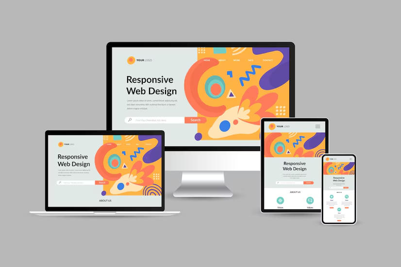
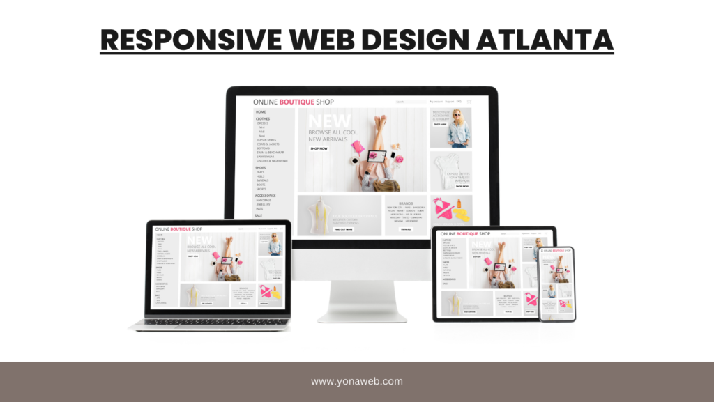
At its core, responsive web design is an approach that ensures a website looks and functions well across a wide range of devices and screen sizes. Instead of creating separate designs for desktops, tablets, and mobile phones, a responsive website automatically adjusts its layout and elements to fit the screen it’s being viewed on.
This adaptability is achieved by integrating several key techniques, such as fluid grids, flexible images, and CSS media queries. Fluid grids allow the layout to proportionally resize elements based on the screen size, ensuring that your website structure adjusts without breaking. This eliminates the need to design separate layouts for every device, maintaining consistency across screens. CSS media queries further refine this approach by applying specific styling rules only when the browser’s dimensions meet predefined conditions.
Flexible images play a crucial role in responsive design by dynamically adjusting their size to fit within their containing elements. This prevents content overflow and ensures images render appropriately on all devices, whether it’s a smartphone or a desktop screen. Designers often use relative units, such as percentages, rather than fixed pixel dimensions to maintain smooth scaling. In combination with the fluid grid, this technique allows media elements to seamlessly shrink or enlarge based on the user’s viewing environment.
CSS media queries enhance adaptability by letting designers implement different design rules tailored to specific screen widths or orientations. For example, a sidebar that appears on larger screens can be hidden or repositioned on smaller devices to improve readability. This modular approach ensures that users have access to the most relevant content while enjoying a well-organized, optimized experience, regardless of how they interact with the site.
Ultimately, these components—fluid grids, flexible images, and CSS media queries—work harmoniously to create a dynamic design that prioritizes user experience. By focusing on adaptability, responsive web design addresses the evolving needs of users across various devices and browsers. This ensures that visitors consistently receive a cohesive and enjoyable experience, whether they are accessing the site from a laptop, tablet, or smartphone.
Key Components of Responsive Web Design
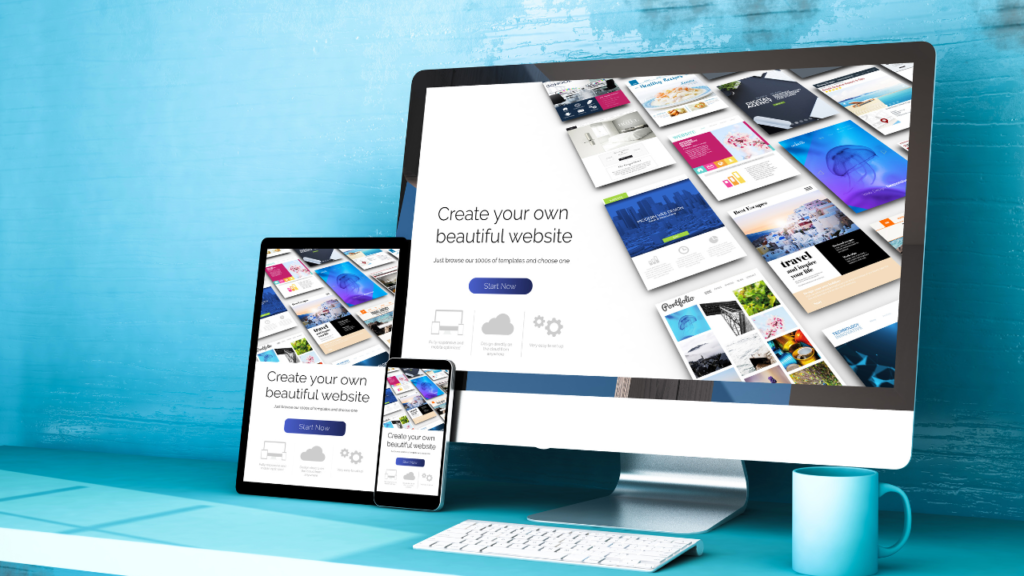
Responsive web design (RWD) is built on a few fundamental concepts that every web designer and developer should master. This approach ensures that websites can adapt seamlessly to a variety of devices and screen sizes. A key aspect of RWD is understanding how a site must respond dynamically to the user’s behavior, device type, and screen orientation. This flexibility provides a more personalized and optimized viewing experience.
Learning how to implement fluid grids, flexible images, and media queries is essential for creating responsive websites. These elements ensure that the site responds proportionately, scaling content and images without compromising design quality. Examples of well-designed responsive sites demonstrate the importance of user-focused layouts, providing the same level of usability across desktops, tablets, and smartphones.
The goal of responsive design is to create sites that offer consistent performance and smooth interactions, regardless of the device being used. With users shifting between multiple devices daily, adopting a responsive approach allows websites to maintain functionality and appeal, meeting the expectations of modern users effectively.
1. Fluid Grids: The Foundation of Flexibility
A fluid grid is the backbone of responsive web design. Unlike fixed-width layouts, which define specific pixel dimensions for elements, fluid grids use relative units like percentages to allow content to resize dynamically as the screen width changes.
Think of fluid grids as a flexible framework. Instead of setting a column to a fixed width of 300 pixels, you would define it as a percentage of the parent container’s width, such as 25%. This ensures that the layout adapts to different screen sizes while maintaining its structure.
For example, a three-column layout on a desktop might transform into a single-column layout on a smartphone, with each column stacking on top of the other. By designing with fluid grids, you’re ensuring that your site’s content remains readable and well-organized, no matter the device.
Pro Tip: When designing with fluid grids, use a mobile-first approach. Start by designing for the smallest screen size, and then progressively enhance the layout for larger screens. This ensures that your design remains simple, efficient, and adaptable.
2. Flexible Images and Media

In responsive web design, it’s not enough for your layout to be flexible; your images and media need to scale accordingly as well. A common issue arises when images are fixed in size, causing them to either overflow on small screens or appear pixelated on larger displays.
To solve this problem, you should use flexible images. By setting image widths to a percentage (e.g., width: 100%), images will resize themselves proportionally to the screen size. This approach keeps images looking sharp and ensures they don’t break the layout.
For more complex cases, such as using high-resolution images for Retina displays or serving different image sizes depending on the device, the HTML <picture> element or srcset attribute is a powerful tool. This allows you to serve multiple image versions and ensures the best one is displayed for each device, improving both performance and user experience.
In addition to images, other media elements like videos and iframes also need to be made responsive. A common technique for handling responsive videos is to use CSS to maintain the correct aspect ratio, allowing the video to resize fluidly.
3. CSS Media Queries: The Magic Behind Responsive Breakpoints
While fluid grids and flexible images allow your design to scale, media queries enable you to apply specific styles based on the screen’s size, resolution, or orientation. This is where you can define “breakpoints,” which trigger changes in the layout to ensure that content remains user-friendly across different devices.
Media queries are simple to use in CSS. For example, you can specify different styles for screens larger than 768 pixels (commonly used for tablets) and screens larger than 1024 pixels (for desktops):
cssCopy code/* Styles for devices with a width of at least 768px */
@media only screen and (min-width: 768px) {
  .container {
    display: flex;
    justify-content: space-between;
  }
}

/* Styles for devices with a width of at least 1024px */
@media only screen and (min-width: 1024px) {
  .container {
    max-width: 1200px;
  }
}
In the example above, you’re adjusting the layout and container size at different breakpoints, ensuring the design adapts to the screen size. This is the secret sauce of responsive design—it lets you optimize the user experience for any device.
Common Breakpoints for Responsive Design:
- 320px – Small smartphones
- 768px – Tablets
- 1024px – Small desktops and tablets in landscape
- 1440px – Large desktops
When defining breakpoints, remember that they don’t have to be rigidly tied to specific devices. Instead, focus on when the design naturally breaks or looks cramped, and adjust accordingly.
4. Mobile-First Approach: A Mindset Shift

With mobile devices accounting for a significant portion of web traffic, designing for mobile first is no longer optional. A mobile-first approach means you prioritize designing for smaller screens first and then progressively enhance the design for larger devices.
Why is this approach important? Designing for mobile first forces you to focus on the essentials. You’re less likely to overcrowd the interface with unnecessary features, and you’ll naturally design simpler, more user-friendly experiences. As you move to larger screens, you can add more complexity and enrich the design without sacrificing performance.
Mobile-first design also aligns with Google’s mobile-first indexing strategy, where Google primarily uses the mobile version of your site for ranking and indexing. A responsive, mobile-first design ensures that your site performs well across devices, giving you an SEO advantage.
Common Mistakes in Responsive Web Design (and How to Avoid Them)
While responsive web design is a powerful tool, it’s easy to fall into some common traps. Here are a few mistakes to watch out for:
1. Overloading the Mobile Experience
Designing for mobile doesn’t mean replicating the desktop experience on a smaller screen. The optimal approach is to adapt the content to fit the needs of mobile users. Prioritizing essential elements ensures that the interface is user-friendly and avoids overwhelming users with unnecessary features. A clutter-free environment improves navigation and keeps visitors engaged, increasing the chances they will interact with the most important components of the site.
Good design practices include using responsive techniques that allow the website to render seamlessly across different screen sizes. This practice not only ensures faster load times but also creates a smoother browsing experience, reducing frustration and bounce rates. For example, mobile-friendly buttons and simplified menus help users complete tasks easily without excessive scrolling or zooming.
By adapting layouts for mobile, designers create a complete experience optimized for the smaller screen. The benefits of this approach are numerous: faster loading, better usability, and higher engagement levels. Ultimately, an optimized mobile environment helps businesses meet user expectations, increasing the likelihood of conversions and positive interactions across all devices.
2. Ignoring Performance
Responsive web design isn’t just about aesthetics—it’s also focused on how well the site performs. Large, unoptimized images or JavaScript-heavy elements can shrink the site’s efficiency by slowing down load times, particularly on mobile devices with limited bandwidth. An essential idea in responsive design is to guide designers toward optimizing images and minimizing code bloat. Delivering smaller file sizes through compression tools helps improve performance, ensuring a smoother user experience.
When working on a site’s performance, developers often use a technique called lazy loading, which hides non-critical content until it becomes visible to the user. This dynamic method prevents the page from being overloaded on initial load and allows elements to behave differently based on the user’s interaction, improving speed. Prioritizing critical resources ensures essential content is accessible first, enhancing the perception of speed.
Designers must also enlarge their focus on responsive behavior, such as using CSS media queries to guide how elements adapt to different screens. Ensuring images and layouts adjust dynamically prevents them from breaking on various devices. An optimized site not only behaves responsively but also meets users’ expectations with fast, efficient loading times. These best practices build a seamless and enjoyable experience across all platforms.
3. Focusing on Fixed Breakpoints
While it’s tempting to focus on specific devices, such as designing exclusively for the iPhone or iPad, this approach can create limitations. Aiming for flexibility through fluid layouts ensures your design can respond naturally to any device, including phones, tablets, or desktop browsers. Fluid layouts rely on proportional elements that resize based on the viewing window, preventing rigid structures that might not adapt well across varying screen sizes.
A key step in ensuring responsiveness is identifying natural breakpoints where design adjustments are needed. These breakpoints allow your layout to adapt smoothly when transitioning between different devices, such as a tablet and a laptop. By exploring responsive frameworks or CSS media queries, designers can build resource-efficient sites that work seamlessly across a range of screen dimensions without needing separate versions for each device.
Instead of targeting specific devices, the focus should be on optimizing the experience across multiple browsers and screen sizes. As users access your content through an ever-increasing range of devices, the ability to adjust layouts dynamically based on the browser window becomes essential. This practice ensures that your site remains consistent and functional, providing an optimal experience regardless of where it is viewed.
Conclusion: Building the Future with Responsive Web Design
Mastering the fundamentals of responsive web design is essential for creating flexible, adaptive, and user-friendly websites. By understanding the principles of fluid grids, flexible images, media queries, and mobile-first design, web designers and developers can create websites that look and function beautifully across all devices.
As technology continues to evolve and new devices emerge, the need for responsive, adaptable design will only grow. By incorporating these core concepts into your workflow, you’ll not only improve the user experience but also stay ahead of the curve in a rapidly changing digital landscape.
If you’re ready to build websites that stand the test of time and work seamlessly on any screen, responsive web design is your answer. Start experimenting, keep refining your approach, and embrace the flexibility that comes with designing for all devices.
