introduction
In today’s digital landscape, modern minimalist web design has emerged as a powerful trend shaping the way brands communicate with their audience online. By focusing on simplicity, clarity, and a clutter-free user experience, businesses can capture attention without overwhelming visitors. But what exactly does this approach entail, and how can you apply it to create a stunning, functional website?
This article will guide you through the essential principles of modern minimalist web design, why it’s effective, and how you can implement these strategies to make your website stand out in 2024. Whether you’re a seasoned web designer or a small business owner, there are actionable insights here for everyone.
Why Modern Minimalist Web Design Is So Popular
Over the past decade, we’ve seen a major shift in web design trends. What was once dominated by flashy visuals, heavy text blocks, and overwhelming options has given way to sleek, straightforward designs that prioritize functionality over flair. Modern minimalist web design capitalizes on these preferences by offering a clean, aesthetically pleasing interface that emphasizes user experience above all else.
Simplicity Equals Efficiency
One of the core reasons behind the popularity of minimalist design is its simplicity. When users land on a website, they don’t want to be bombarded with information or flashy graphics that take forever to load. Instead, they prefer an intuitive experience where they can quickly find what they need. Minimalism helps eliminate distractions, allowing the user to focus on the content and functionality that matters most.
Key Principles of Modern Minimalist Web Design
Modern minimalist web design is not just about removing elements but about being intentional with what remains. There are several foundational principles that guide this design approach:
1. Use of White Space
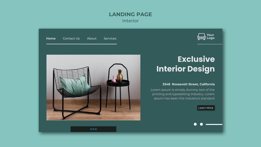
White space, often referred to as negative space, is one of the defining characteristics of modern minimalist web design. White space doesn’t necessarily mean the area has to be white, but it refers to the empty space between elements on the page. It provides breathing room, making content easier to digest and the page more visually appealing.
2. Focus on Typography
In minimalist design, typography takes center stage. Instead of cluttering the page with unnecessary images, a well-chosen font can communicate a brand’s personality and message. By keeping typography bold, clear, and concise, you guide the user through the website in a straightforward manner. Minimalist websites typically opt for sans-serif fonts that are both elegant and easy to read.
3. Limit Your Color Palette
Minimalism thrives on simplicity, and this extends to color choices. A restrained color palette (usually one to three colors) ensures the website looks cohesive and visually pleasing. Most minimalist designs use neutral tones like black, white, and gray, but a pop of bright color can be added to draw attention to key areas such as call-to-action buttons or links.
4. Prioritize Content Over Graphics
Content remains king, especially in minimalist web design. The fewer distractions you provide, the more users will engage with your content. This doesn’t mean you have to eliminate images altogether—just ensure that the ones you do use are purposeful and enhance the user experience.
How to Achieve Modern Minimalist Web Design in 2024
In 2024, websites must be not only aesthetically pleasing but also functional and fast. Here’s how you can achieve the perfect modern minimalist web design for your site:
1. Optimize for Speed
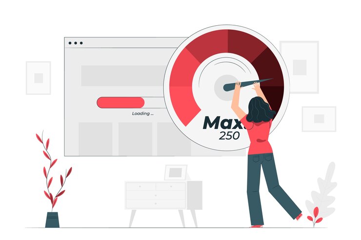
Website speed is a top priority for users. If a page takes more than three seconds to load, users will often abandon it. Since minimalist design inherently uses fewer elements, it’s easier to optimize for fast loading times. Compress images, use efficient coding practices, and limit the use of large videos or animations to ensure your site loads quickly.
2. Make It Mobile-First
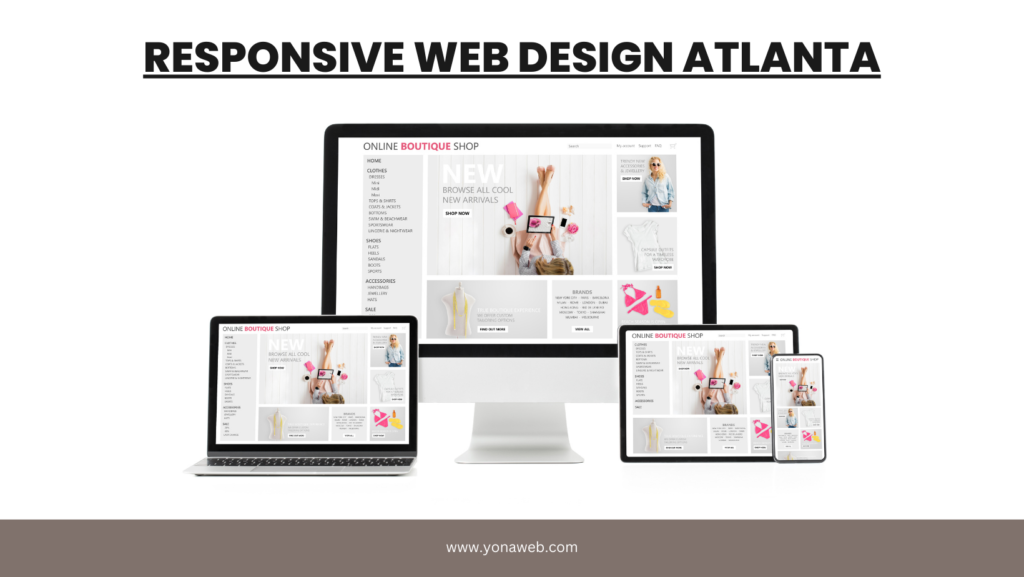
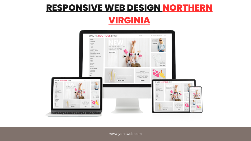
With the majority of users now accessing websites through their phones, it’s crucial to adopt a mobile-first approach to web design. A modern minimalist web design should seamlessly adapt to smaller screens, ensuring a smooth and intuitive experience for mobile users.
3. Clean Navigation
Navigation should be intuitive and simple. A minimalist menu, often in the form of a hamburger icon or a top bar with just a few options, makes it easy for users to find what they’re looking for without feeling overwhelmed. Keep navigation limited to the most important pages.
4. Choose Visuals Wisely
Images should be carefully curated to fit the minimalist theme. High-quality, relevant visuals can help reinforce your brand message, but overloading the page with images will detract from the user experience. Opt for one or two strategic images rather than an image-heavy layout.
Benefits of Modern Minimalist Web Design
Aside from the sleek, professional appearance, modern minimalist web design offers a wide range of advantages:
Improved User Experience
With fewer distractions, users can navigate the site more easily, find the information they need, and focus on engaging with your content. A clean design puts the user first, which leads to higher satisfaction and retention rates.
Faster Loading Times
Minimalism naturally reduces the amount of content that needs to load, meaning faster page speeds. This not only improves user experience but also boosts SEO, as search engines favor fast-loading websites.
Enhanced Brand Focus
A minimalist design allows the core message and brand identity to shine through without the clutter of excess elements. By emphasizing your brand’s key messages, visitors are more likely to remember and connect with your business.
Modern Minimalist Web Design and SEO

Contrary to what some might think, modern minimalist web design can actually enhance your SEO efforts. Search engines prioritize websites that offer excellent user experience, fast loading times, and mobile responsiveness—all of which are key aspects of minimalist design.
Here are some ways minimalist design improves SEO:
1. Faster Page Load Speeds
Search engines rank fast-loading websites higher because users are more likely to stay on a site that loads quickly. A minimalist design, with fewer elements and optimized images, naturally loads faster.
2. Improved Mobile Experience
Google’s mobile-first indexing means that websites optimized for mobile devices are prioritized in search results. Minimalist web designs typically translate better to mobile because of their simple layouts, clean fonts, and streamlined navigation.
3. Higher Engagement Rates
By focusing on user experience, minimalist designs encourage visitors to stay longer, engage more with your content, and convert at higher rates. Search engines take this behavior into account when ranking sites, meaning a modern minimalist web design could give you an SEO boost.
Common Mistakes to Avoid in Minimalist Web Design
While modern minimalist web design has numerous benefits, it’s easy to go too far and create a website that feels empty or lacks functionality. Here are some common pitfalls to watch out for:
1. Over-Simplification
Minimalism doesn’t mean removing all elements. If your website lacks critical navigation tools or enough content, visitors might become confused or frustrated. Balance simplicity with usability.
2. Ignoring Brand Personality
Minimalism should enhance your brand, not erase it. Don’t strip away so much of your design that your brand loses its unique voice or visual identity. Minimalism should reflect your brand’s personality in a clean, clear way.
3. Poor Contrast
Minimalist designs can sometimes suffer from a lack of contrast, making it hard for users to differentiate between clickable elements and static content. Make sure your design uses sufficient contrast, especially when it comes to text and buttons.
Conclusion
Modern minimalist web design is the future of online aesthetics. Its simplicity, focus on user experience, and ability to enhance brand identity make it a must for any business looking to succeed online in 2024 and beyond. By incorporating these key principles, you can create a website that not only looks beautiful but also performs exceptionally well across all devices.
For small businesses looking for affordable yet effective web design solutions, check out our guide to unlocking success with low-cost web design and start building a minimalist website that works for you today!
FAQs
What is modern minimalist web design?
Modern minimalist web design focuses on simplicity, clean lines, and a user-friendly interface that prioritizes content over unnecessary design elements.
How can I optimize my minimalist website for SEO?
To optimize a minimalist website for SEO, focus on fast loading times, mobile responsiveness, and providing a clear user experience. Minimalist designs naturally help with these elements, improving your SEO ranking.
Is modern minimalist web design suitable for mobile devices?
Yes, minimalist web designs are perfect for mobile because of their simple layouts, fast load times, and intuitive navigation, making them more accessible for mobile users.
What colors work best for minimalist web design?
Neutral colors such as white, black, and gray are often used in minimalist designs, but adding a single bright accent color can help draw attention to important elements like call-to-action buttons.
Can modern minimalist web design improve user engagement?
Yes, minimalist web design can enhance user engagement by removing distractions and making it easier for visitors to navigate the site and focus on your content.
What are the main benefits of using modern minimalist web design?
The main benefits include faster loading times, improved user experience, enhanced brand focus, and better mobile compatibility.
Thanks for reading my content plz share
